Table of content
- What is mobile-first design in email marketing?
- The real mobile shift: It’s about behavior, not screens
- Start where the customer starts: Inbox view
- One column, one purpose
- Thumb zones & CTA magic
- Speed is everything: Optimize for load time
- Dark mode isn’t optional anymore
- Interactive emails with AMP for email
- Design for humans (Not just screens)
- Personalization in the micro-moment
- Accessibility for all
- Test, track, tweak
- Final thoughts: Mobile-first is ROI-first
In the era of constant scrolling, push notifications, and fast thumb swipes, email marketing is no longer just about showing up in an inbox, it’s about showing up right on their phone, at the right moment, with the right design. And that means going mobile-first.
According to Movable Ink, more than 65% of email opens happen on mobile devices. That number is growing each year, especially in regions like India and the U.S., where mobile internet usage has exploded. Still, too many brands create emails that look stunning on desktops but fall apart on a mobile screen. That’s not just a bad user experience; it’s lost revenue.
At Kasplo, we believe mobile-first is not just a design strategy; it’s a business advantage. Let’s break down why and how your email marketing should prioritize mobile-first design, with real stats, modern techniques, and even AMP for Email to supercharge engagement.
What is mobile-first design in email marketing?
Mobile-first design is exactly what it sounds like: designing your email campaigns primarily for mobile devices, then scaling up for desktops or tablets. This is the reverse of the traditional method, where emails are first designed for big screens and then adapted (often poorly) for mobile.
But here’s the thing: mobile-first isn’t just resizing images or stacking columns. It’s rethinking content hierarchy, interactivity, performance, and usability from a mobile user’s perspective.
Let’s dive into what that actually means and how you can execute it effectively.
The real mobile shift: It’s about behavior, not screens
People don’t just open emails on mobile, they live in their inboxes on mobile. We check our phones up to 144 times a day. Emails are no longer consumed while sitting in front of a monitor, they’re browsed while standing in line, commuting, waiting for coffee, or scrolling in bed at midnight.
Here’s the behavior shift:
- If your email doesn’t load quickly, it gets swiped away.
- If the design isn’t clean and legible, it’s ignored.
- If the CTA isn’t easily tappable, you lose the click.
- If it doesn’t engage instantly, it’s deleted without a second thought.
The average time spent reading a mobile email is just 8 seconds. That’s all the time you have to make an impression.
So what does a truly mobile-first email look like in today’s world?
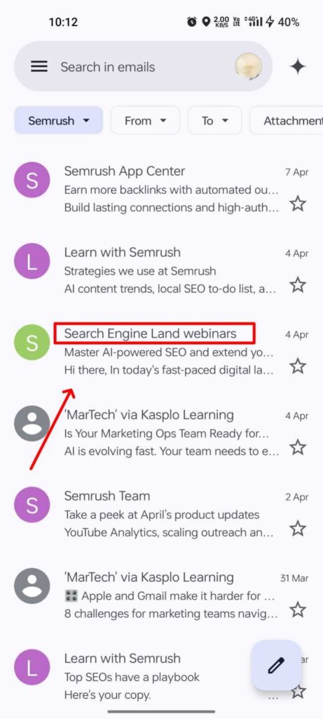
Start where the customer starts: Inbox view
On mobile, your subject line and preview text (preheader) are your first shot at capturing attention, and space is limited.
- Subject lines get cut off after ~35 – 40 characters on most mobile screens.
- Preheaders offer 80 – 90 characters max, often less on smaller devices.
Best Practices:
- Put the key message or value first.
- Use actionable words and emojis strategically.
- At Kasplo, we enable A/B testing for subject lines and preheaders to help you nail this crucial first impression.
Pro Tip: Use dynamic preheaders with conditional logic; if opened on mobile, show a shorter message; if opened on desktop, show a longer one.
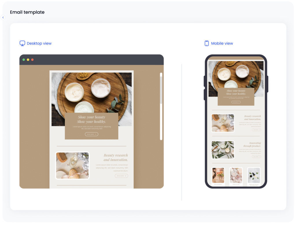
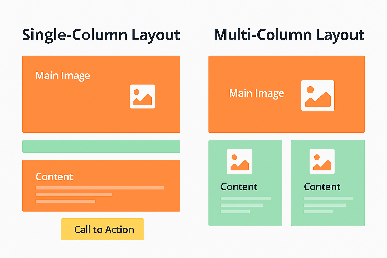
One column, one purpose
Mobile screens are narrow, and users scroll fast. Multi-column layouts often become cluttered or unreadable.
Design Tip: Stick to a single-column layout with a clear hierarchy. Prioritize what matters most above the fold (the first screen without scrolling).
Emails with a single-column mobile-optimized design see a 24% higher click-through rate compared to non-optimized emails.
At Kasplo, our visual builder automatically adapts layouts for mobile screens with built-in responsive templates.
Thumb zones & CTA magic
People navigate mobile screens with their thumbs, not a mouse or trackpad. If your call-to-action (CTA) is hard to tap, you’re losing conversions.
Where to place CTAs:
- Not too close to the top (people may miss it).
- Not at the very bottom (some users may not scroll).
- Place CTAs in the mid-zone and repeat them subtly.
What size? Buttons should be at least 44×44 pixels with padding.
Kasplo Tip: With our EI vault, you can test multiple CTA positions and styles, and use heatmaps to understand which gets the most clicks.
Speed is everything: Optimize for load time
Slow-loading emails are deadly. Mobile users are impatient. 53% of mobile users abandon content that takes over 3 seconds to load (Google).
Image Tips:
- Use compressed formats like WebP.
- Limit total email size to under 100 KB.
- Avoid image-only emails (text is important for accessibility and deliverability).
Kasplo Advantage: Our system automatically compresses and optimizes images during upload to ensure emails load lightning fast on all devices.
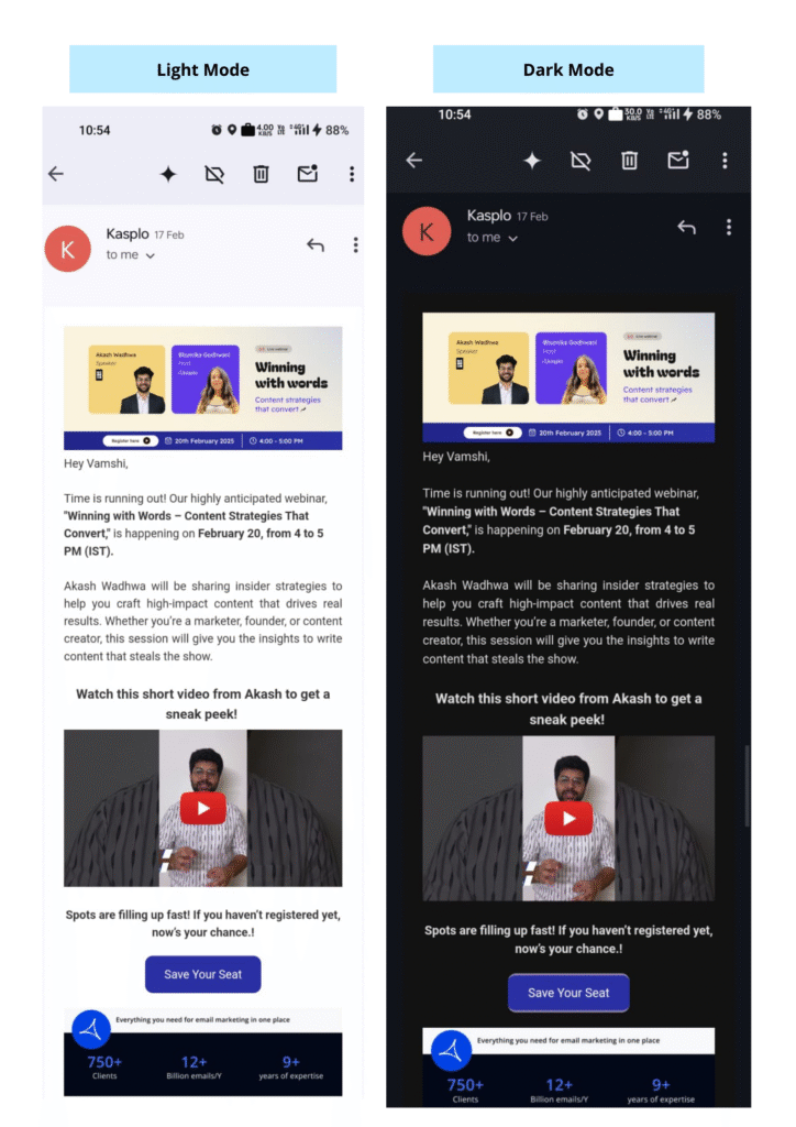
Dark mode isn’t optional anymore
More than 34% of mobile users read emails in dark mode, and that number keeps growing.
If your design isn’t dark-mode friendly, your email could look broken, with white text on white background, logos that disappear, or visual elements that look harsh.
Design Tips:
- Use transparent PNGs instead of white-background images.
- Avoid pure black or pure white.
- Test across popular email clients like Gmail, Outlook, and Apple Mail.
Kasplo’s inbox preview tool lets you simulate how your email looks in light and dark modes across devices before you hit send.
Interactive emails with AMP for email
AMP (Accelerated Mobile Pages) emails enable you to send dynamic, interactive content directly in your inbox without the need for users to click through to a browser. Carousels, accordion menus, interactive forms, or real-time updates are just some of the possibilities AMP presents that improve the mobile email experience beyond the static, orchestrated content of traditional email. AMP helps streamline the experience to be much more app-like and user-friendly, and reduces the friction point, especially on small screens where email interactions can feel clunky or limited.
- Interactive Forms Within Emails: Users can fill out surveys, feedback forms, or other lead-gen forms right inside the email, without having to open a new tab. This is great for mobile users who want to be able to easily interact.
- Live Updates: AMP allows content (pricing, availability, live scores, etc) to dynamically update at the time of the email, allowing for mobile users to keep up to date without refreshing or leaving the email.
- In-Email Shopping Experiences: Users can scroll through product listings, view carousels, and even add items to their cart all within the email. This drastically reduces friction and increases conversions on mobile.
- Appointment Booking & Event RSVPs: Mobile users will be able to select dates, RSVP to events, or schedule appointments directly within the email, so it is quick and easy.
- Accordion & Carousel Layouts: These space-efficient components enable long-form content to be broken out into expandable or swipeable cards, which makes reading on smaller screens more pleasurable.
- User-Generated Content & Reviews: Provide opportunities for users to submit reviews, ratings, or comments directly from their inbox, great for users who may want to engage on the go.
- Dynamic Content Personalization: AMP also supports personalized content blocks, meaning the content may change based on different user behavior, time zones, or preferred settings. This is ideal for mobile campaigns where you want your audience to feel the content is relevant in the moment.
- Progressive Onboarding & Tutorials: User onboarding and tutorials that guide users through steps or highlight features can be done interactively inside the email and keep users engaged, even on mobile.
Progressive Onboarding & Tutorials: User onboarding and tutorials that guide users through steps or highlight features can be done interactively inside the email and keep users engaged, even on mobile.one-friendly design, such as accordions and carousels, makes on-screen content easier to read and digest on small screen real estate.
Optimized for Mobile Devices
- No redirects or additional load time: everything occurs within the email.
- Clean, responsive designs using accordions and carousels for smaller screens.
In-Email Functionality
- Complete forms, shop for products, and RSVP for an event all within the email itself. Fill out forms, browse products, and RSVP to events without leaving the email.
- Real-time updates for pricing, availability, etc.
Gamified Experiences
- The Spin the Wheel feature creates a fun way to interact with email.
- Enhances engagement and adds to conversion opportunities, a great experience for mobile smartphone users seeking a fast reward.
{Video/GIF}
Dynamic & Personalized Content
- Content that changes based on time, user behavior, or location.
- Dynamic content keeps mobile email campaigns fresh, relevant, and user-centric.
Kasplo AMP gives an app-like experience to emails, enabling brands to build memorable mobile experiences. With a mix of utility and interactivity, Kasplo ensures that your emails do not only land in the inbox; more importantly, they create an experience worth engaging with when on the go.
Explore Kasplo’s mobile-first AMP emails and see how we’re helping marketers inbox smarter.
Design for humans (Not just screens)
Humans on mobile behave differently:
- They skim more.
- They spend less than 10 seconds deciding whether to engage.
- They expect instant gratification.
So give them what they need:
- Big, bold headlines
- Short paragraphs
- Bullet points
- Visual cues (icons, emojis, separators)
Kasplo’s content grader tool can scan your email and highlight areas that are too dense or hard to read.
Personalization in the micro-moment
On mobile, the window to impress is short. That’s why micro-personalization matters:
- Use name, location, and purchase history.
- Show content that’s real-time and relevant.
- Update content dynamically when the email is opened (like live stock updates or weather-based promotions).
Stat Alert: Personalized emails deliver 6x higher transaction rates (Experian).
With Kasplo’s real-time data hooks, you can create dynamic email content that adapts to the moment your user opens it.
Accessibility for all
Mobile-first also means inclusive-first. If your emails aren’t accessible, you’re losing a big part of your audience.
Design for screen readers, color blindness, and vision impairments:
- Use proper HTML structure (headers, alt tags).
- Maintain color contrast ratio.
- Use fonts that are at least 16px in size.
Kasplo’s email validator runs automatic accessibility checks and gives you suggestions to improve readability.
Test, track, tweak
No email strategy is complete without testing. Especially for mobile:
- Test on different devices (iOS, Android)
- Test on different apps (Gmail, Outlook, Yahoo)
- Test in different orientations (portrait vs. landscape)
With Kasplo’s Inbox Tracker and Device Preview, you can see how your email behaves on real-world screens, across carriers and regions.
And once the email is out, track metrics like:
- Mobile vs. desktop open rates
- Click-to-open rate by device
- Heatmaps of scroll depth and tap zones
Then tweak. Optimize. And repeat.
Final thoughts: Mobile-first is ROI-first
Mobile-first design isn’t a buzzword. It’s a response to how your audience lives today—on their phones, on the go, with little patience but high expectations.
At Kasplo, we’re helping brands go beyond mobile-friendly into the realm of mobile-intelligent email marketing. From dynamic AMP content to AI-driven deliverability, we equip you with the tools to:
- Reach your audience where they are
- Deliver the messages they want
- Convert attention into action
Because in the world of mobile, you don’t get a second chance to impress.

Vamshi is a passionate content marketer at Kasplo, with a knack for crafting compelling blogs, case studies, and articles that bridge the gap between SaaS products and people. With a natural enthusiasm for technology and storytelling, he excels at building brand authority, driving customer education, and boosting product adoption through impactful content. When he’s not writing, Vamshi enjoys exploring emerging SaaS trends and studying how leading brands create meaningful connections with their audiences.