Table of content
- 1. Introduction
- 2. Order-related emails
- 3. Account-related emails
- 4. Engagement-related emails
- 5. Other transactional emails
- 6. Best practices for transactional emails
- 7. Transactional email examples: Hitting the mark
- 8. Elevate your transactional emails with Kasplo’s advanced segmentation and workflows
- 9. Wrapping up
Ever bought something online and then become obsessed with refreshing your email to see if you have received the confirmation yet? Oh yeah, that’s the beauty of transactional emails, those messages that show up right after a user takes some action on the site. As silent companions, they are with you throughout the entire customer journey.
And they’re not those annoying promotional emails that spam your inbox every week with tempting offers to buy the newest gadget. It has such clear and straightforward messages like an order confirmation with tracking number or a simple reminder about the scheduled appointment.
But here’s the thing, though transactional emails are something that every business has to have but in reality, these types of emails can be total rockstars when executed properly. Consider receiving a shipping update that you enjoy (yes, we are giggling over the ‘delivered’ status).
People should know that even mere transactional emails can increase your customers’ satisfaction significantly. It proves that you respect the person enough to ensure that they are informed and empowered. Also, being more than mere marketing blasts, they are a chance to more or less hint at that perfect pair of socks to complement the new shoes.
So, the next time you receive a transactional email, take a second to appreciate it. Moreover, it is not just an auto response, but an element of a coherent and effective interaction with a customer which will eventually lead to his loyalty to a brand.
Order-related emails
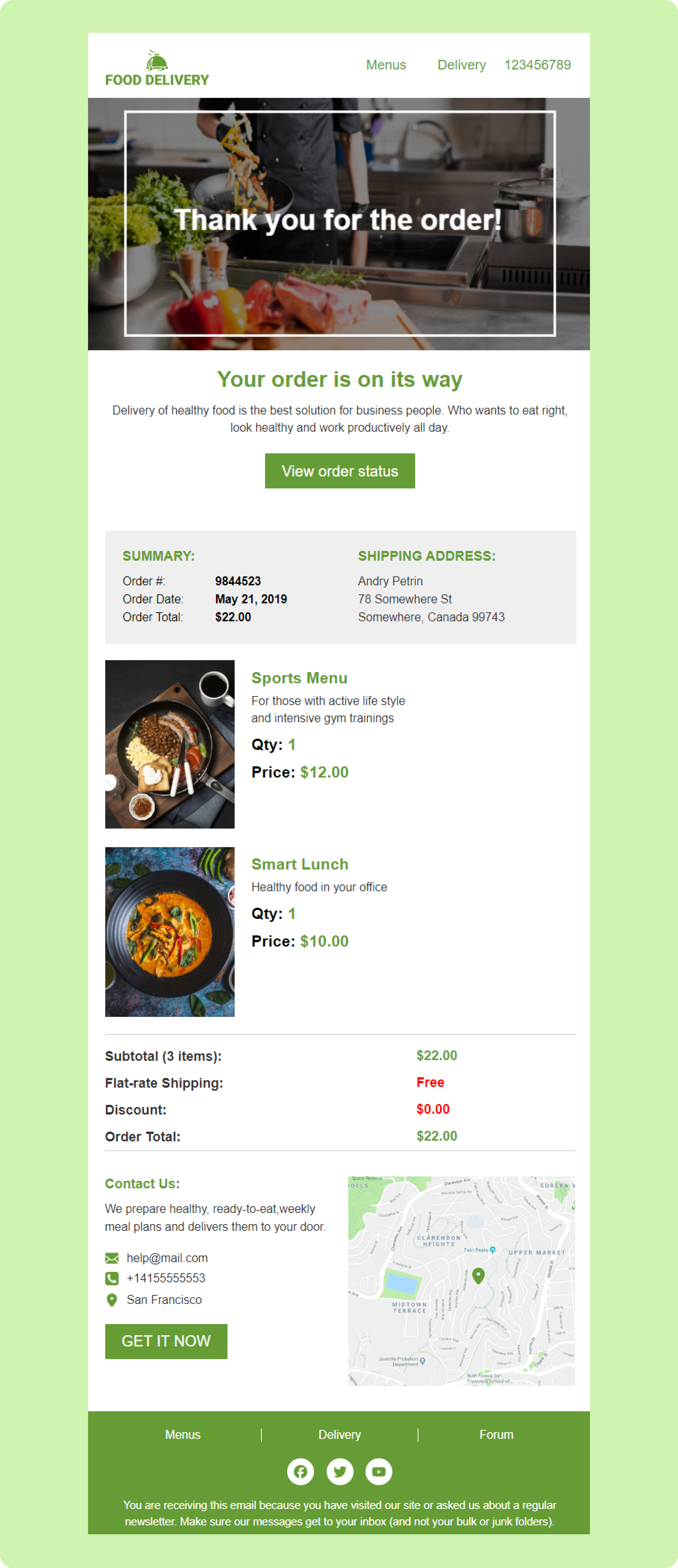
Order confirmation
This is the email where you go, ‘Woohoo, it worked!’ It informs you that your order has been confirmed and everything else including what you ordered and how much it costs.
Shipping confirmation
To me, this one is the life of the party! It informs you that your goodies are now officially in transit and perhaps with a tracking number so you can closely monitor their movements.
Payment confirmation
Do you ever get the strangest of senses the moment you click on the ‘pay’ button? This email confirms that the transaction was processed without any glitches (and possibly hints at the vigorous security measures employed to protect your data).
Delivery notification
The best email of all, happy dance email! This one tells you that your package is here (or parked at the pick-up location) and waiting for you to have fun with.
Account-related emails
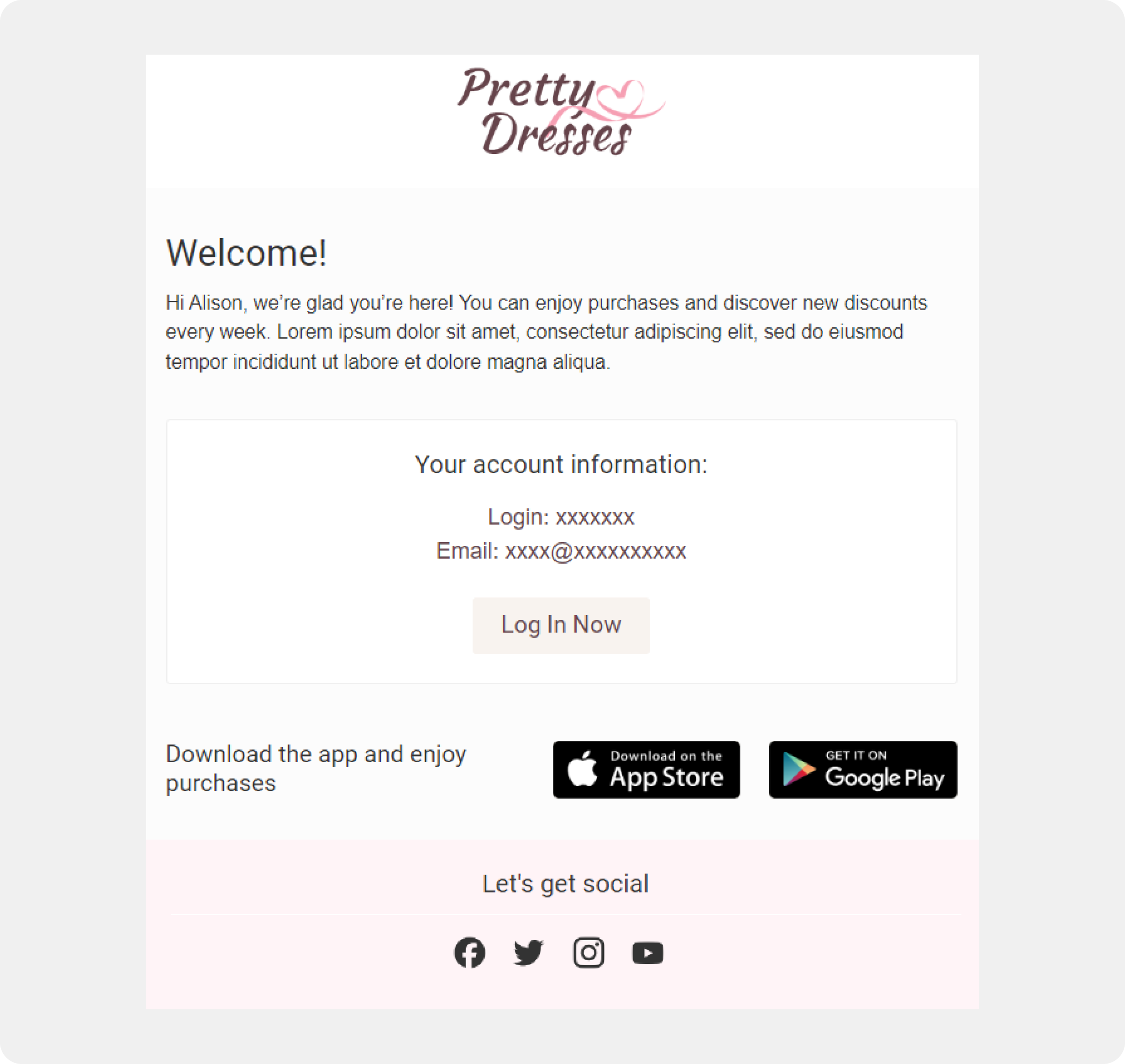
Welcome email
This shall be your first point of contact with the brand. It could contain a simple ‘welcome on board’ note, tips on how to use their website or application.
Account activation
This will be a verification step. This email welcomes you into the platform and gives you a magic link or code to activate your account and all the fantastic features.
Password reset
We have all found ourselves in this situation sometime in our lives – the forgotten password. This email is your knight in shining armor giving you the way to reset your password and continue browsing or shopping.
Update profile information
Have you changed your address or phone number lately? This email enables you to update your account to ensure that you do not lose any message that is of importance to you.
Engagement-related emails
Abandoned cart reminder
All of us, at one point or another, have placed some items in our cart and then accidentally got sidetracked by watching a cat video. This email is a friendly follow-up which reminds you of the products that you may have left on your shopping cart, in case you intended to purchase them.
Feedback request
Brands are always interested to know your reviews on their products! This email may be a customer satisfaction survey where they want to know your stand about a particular product or service they offered to you.
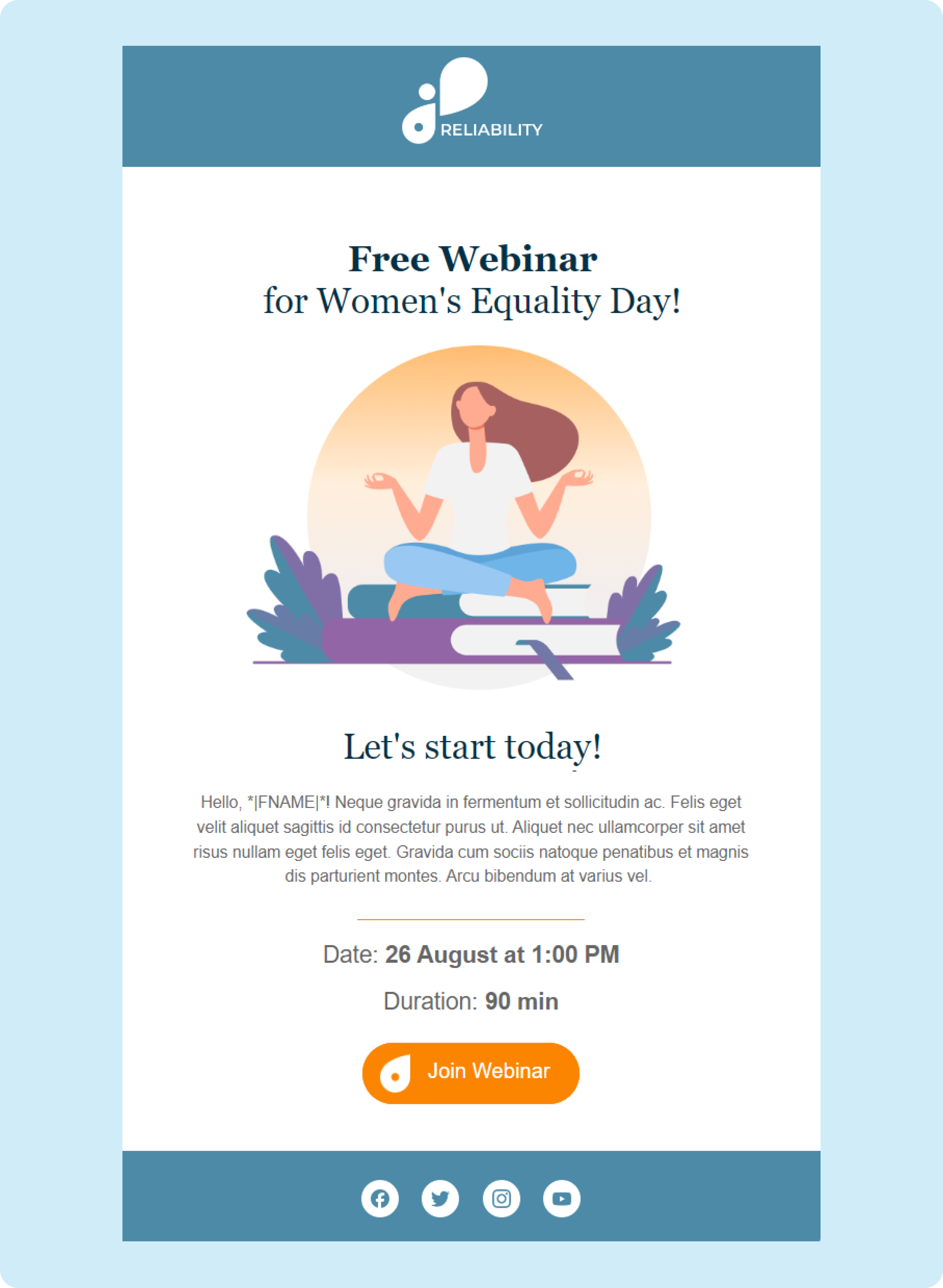
Event reminder/confirmation
Registered for a webinar or a class? This email does not let you forget by reminding you when it will happen, when it will take place and any other crucial information that may be relevant.
Other transactional emails
Appointment confirmation
You have an appointment with a dentist in the near future? This email may contain confirmation of the date and time and possibly a map or contact details for that place. Which helps you to mark your calendar as a reminder.
Free trial reminder/expiration
Free trials are great, but they can just as well vanish overnight. This email notifies you that your free trial is expiring soon and allows you to upgrade before you run out of time.
Return/Refund confirmation
Gotta accept that sometimes, no matter how hard you try, things may just not go your way. This email just informs you that your return or refund request has been processed, thus relieving you of the stress.
Best practices for transactional emails
Mobile first, mobile always
Today, people spend a lot of time on their smartphones, so your emails should be optimized for mobile devices. Go big with fonts and buttons that are simple to read and clickable with your thumbs without struggling. People do not want to zoom in and out just to locate the tracking number!
Short and sweet is a treat
We all are very busy these days so do not write long messages in your emails. Emphasize the order number, tracking information, and the next steps in a way that allows for skimming. It is more like having a conversation with a friend and not a lecture or a speech.
Brand recognition is your friend
Ensure your emails are aligned to your brand’s look and feel. Make sure to incorporate your logo and use the same colors and fonts to give the viewer a familiar and reliable feeling. Receiving an email where the design is totally different from the one used on your website, feels as if people are confusing you with a stranger.
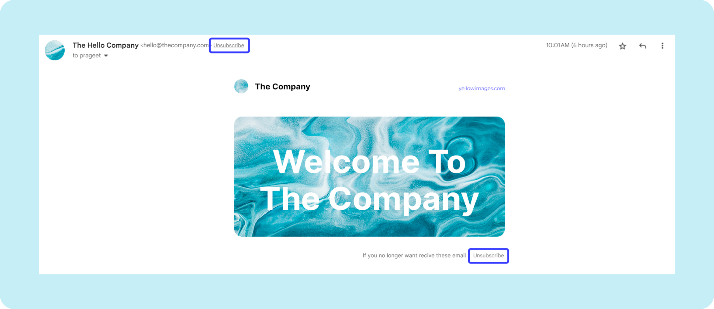
Unsubscribe made easy
No one likes feeling locked in an email jail! The unsubscribe button should always be included and placed in a prominent location. This not only demonstrates to your clients that you value them but also gains their confidence.
Subject lines
The First Impression: The subject line is an open door for making the initial positive impression of your email. Use simple and straightforward subject lines that let the recipient know what to expect when they open it (examples are “Your [Brand Name] Order Confirmation” or “Hi [Customer Name], Reminder for Your Appointment”).
Personalization power
Personalization is key, but only up to a certain extent. It is recommended to address the customer by his or her name, mention the number of the particular order, and write the text in accordance with the customer’s action. For instance, an order confirmation may contain a welcome message for a new client, while an old client may need the tracking information only. It shows you care and makes the email feel less like a spam email and more like a friend’s suggestion.
Call to action
Your secret weapon: If you would like people to do something after reading your email, employ specific and targeted CTAs/links such as “Track Your Order” or “Leave a Review,” and ensure that the buttons are large for ease of use. You can use them as gentle suggestions rather than commandments.
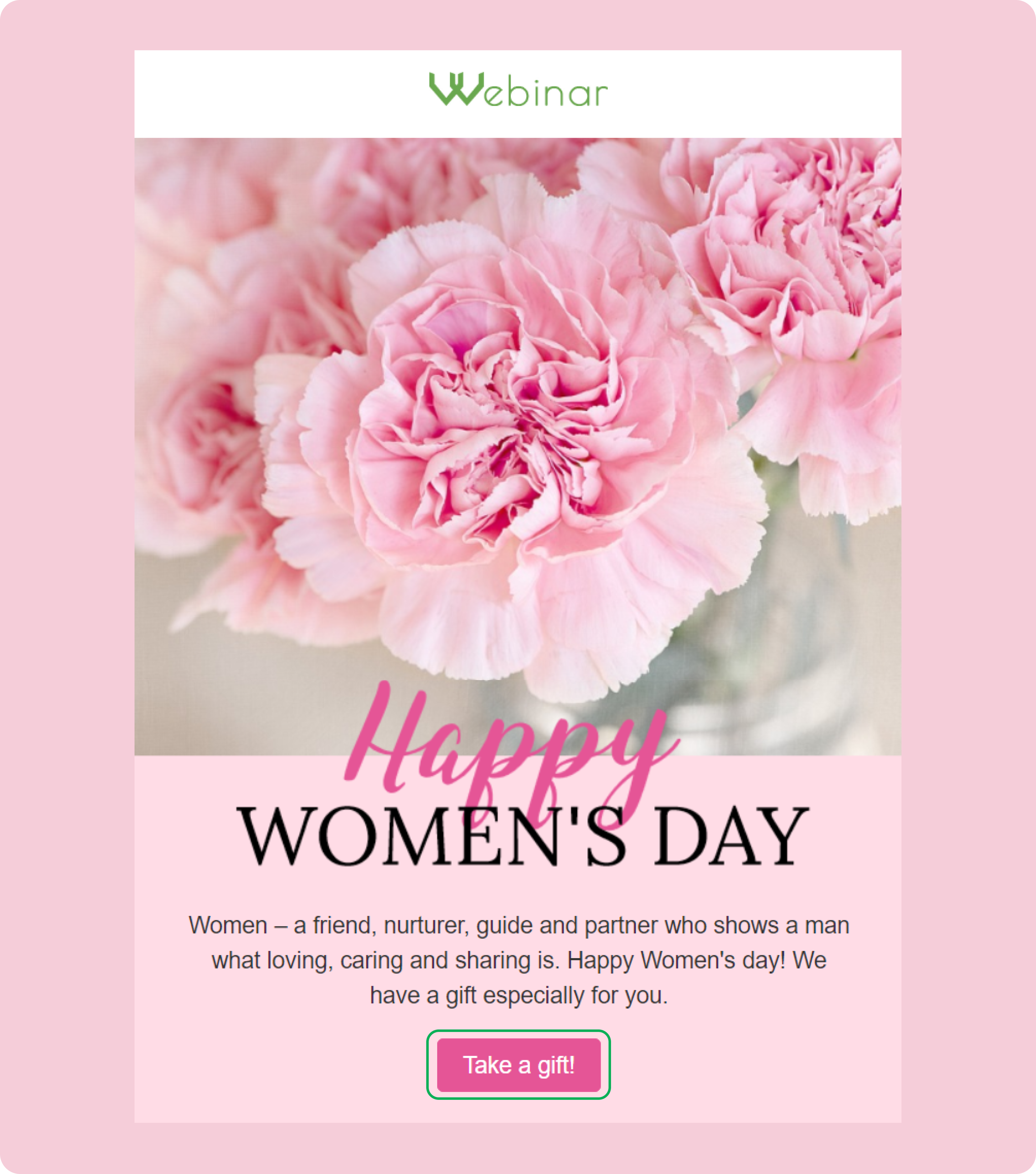
Content that informs, not bores
It means that your email content must be understandable, concise and, I dare say it, interesting. Relax and do not use big words, complicate things and avoid using technical terms. People do not need to read a code only to discover when the next delivery of shoes will be made.
Speak your brand's language
Ensure that the language you use in your emails has a compatibility with the brand personality you wish to portray to the world. Think about your brand as a person, how would it interact with clients?
Timing is everything
Quick, send those emails out! The transactional emails should then be sent immediately after the user performs an action such as purchasing or signing up for the website. Right? Nobody wants to wait for days just to find out whether their order has been processed or not.
Don't be a chatting cat
All of us receive sufficient e-mail messages as it is. Do not send transactional emails in large numbers thereby congesting the customer’s inbox with numerous messages. I believe people do not wish to see the inbox look like a party that has been ruined in some way.
Segmentation
There isn’t only one type of a customer out there. Define the audience to reach them and provide only the data that will be interesting to them. For instance, a confirmation message for a new customer may contain a welcome note while a recurring customer only requires the tracking information. So, think of this as conducting a guided tour for each person separately rather than taking them in a massive group.
By following these simple best practices, you can transform your transactional emails from forgettable notifications into powerful tools for building customer loyalty and a positive brand experience. So go forth and make your transactional emails the superstars they were always meant to be!
Transactional email examples: Hitting the mark
Now let’s take a look at some terrific transactional email examples.
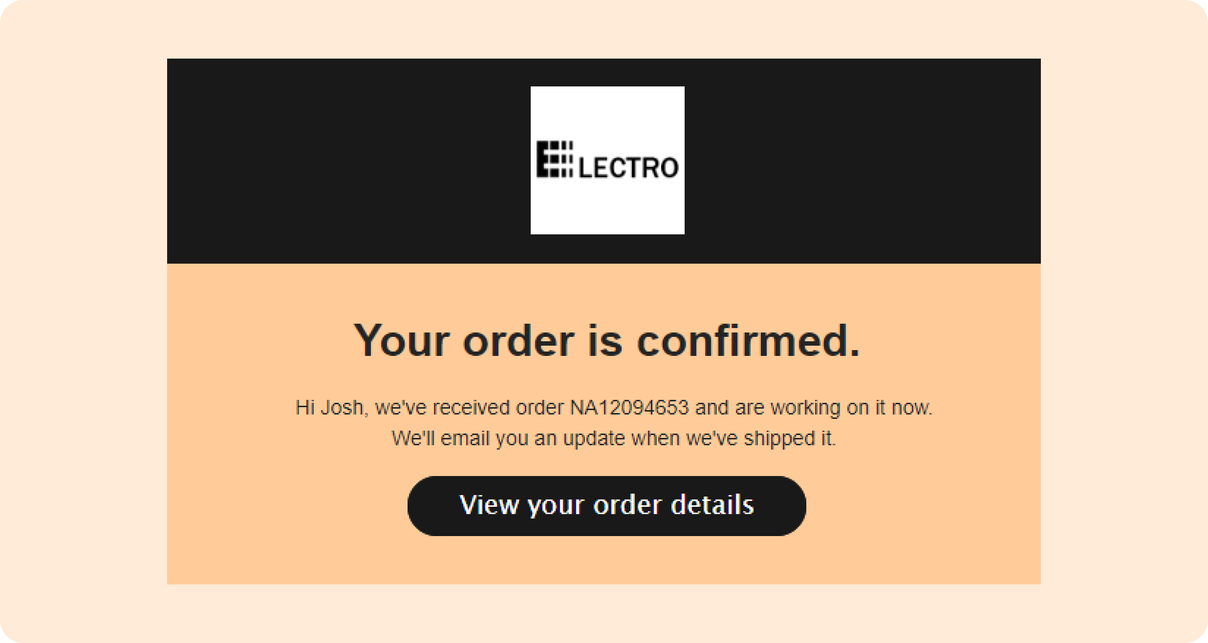
Order confirmation
It is an old wine but it can still be a good wine. One of them is when a fashion retailer provides an image of the product next to order information. This reinforces the purchase decision and motivation. And, if they manage to slip in a few words of advice on how to accessorize based on their features, all for free, that’s always a plus!
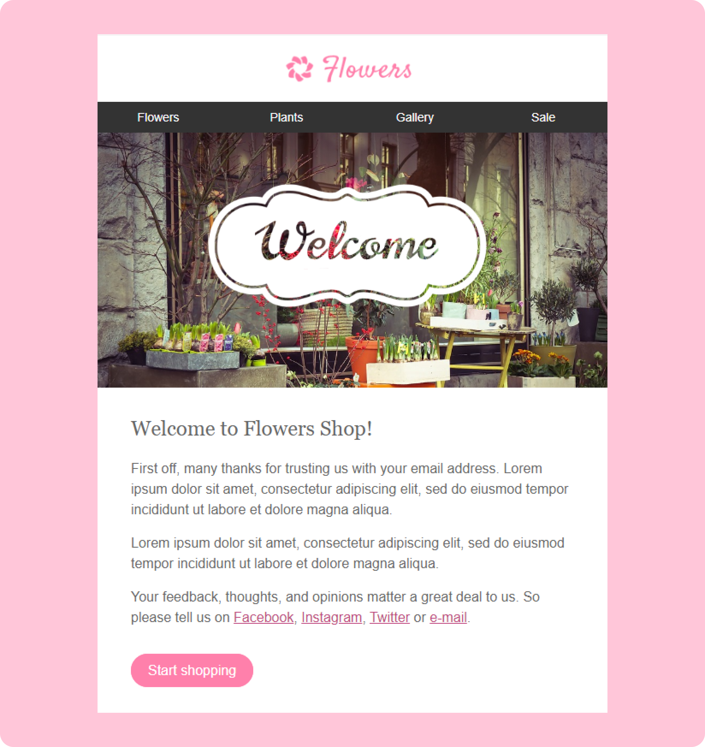
Welcome email
A simple welcome email after account activation with a link and clear, nicely designed instructions for the further work on the streaming service is a winner. New users can even consider it a gesture of goodwill.
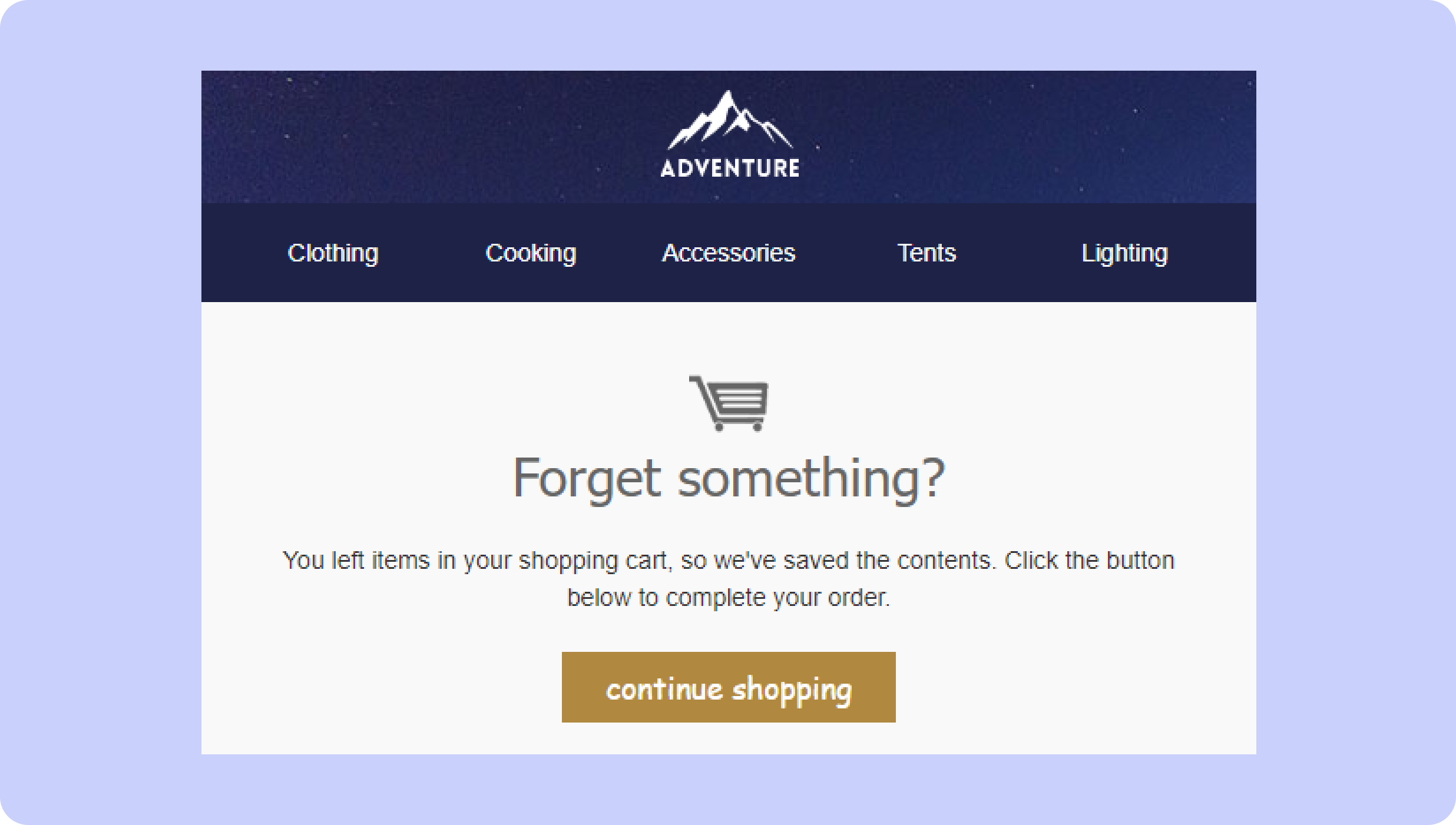
Abandoned cart reminder
A fitness equipment retailer may use an image or an illustration of a person using the left behind treadmill and a CTA such as ‘Get Back to Your Fitness Goals.’ This generates the feeling of scarcity and the need to act.
Appointment confirmation
A salon that provides a confirmation e-mail with the clear time of the appointment, address, and phone number is a must. But to go the extra mile, they could include a summary of the services booked and a gentle reminder of the salon’s cancellation policy.
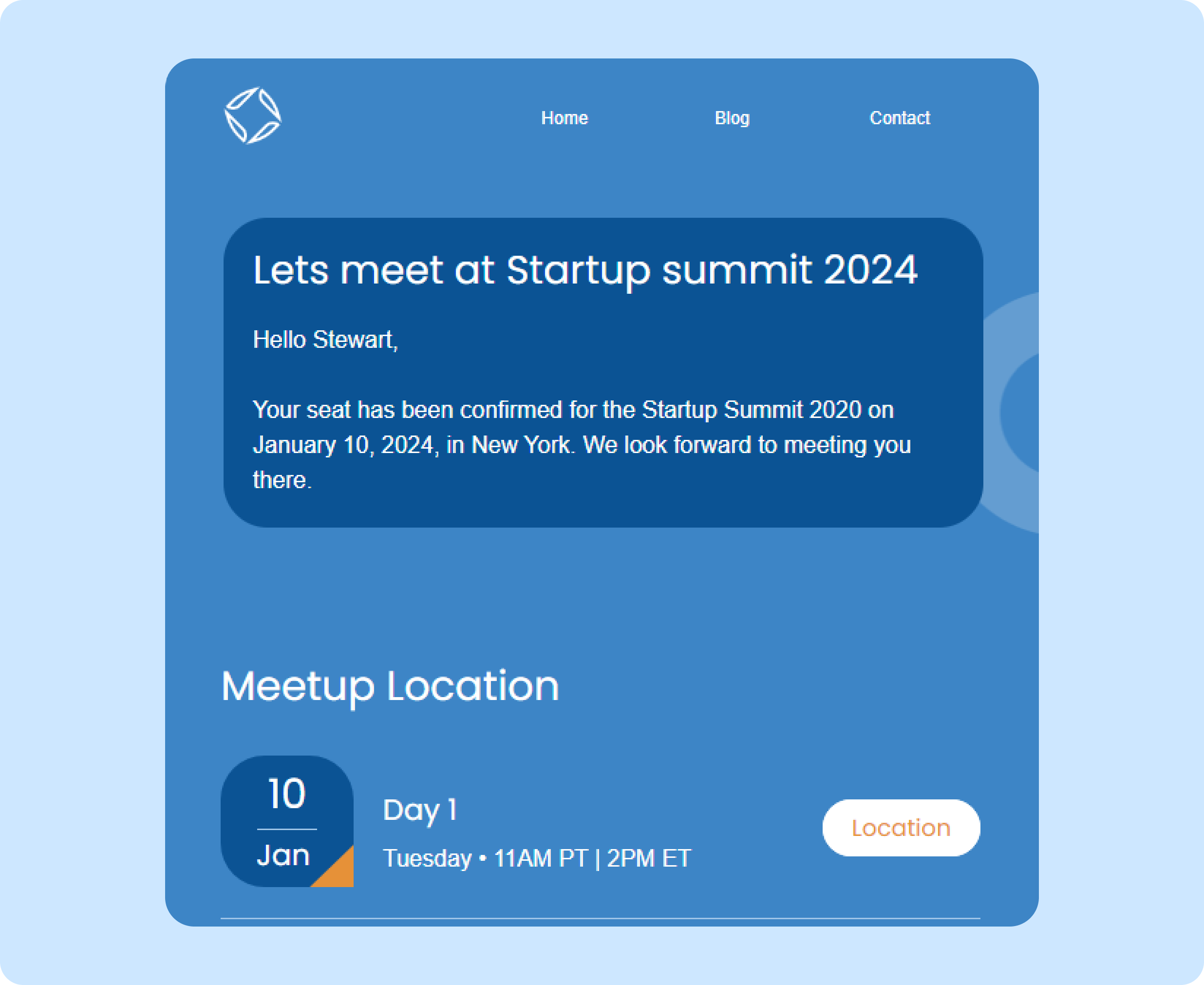
From these examples it is clear that transactional emails can be much more than merely practical. There are many ways that these emails can be turned into opportunities to improve the customer experience through better design, personalization, and strong calls to action.
Elevate your transactional emails with Kasplo’s advanced segmentation and workflows
Kasplo's advanced segmentation
Gone are the days of generic transactional emails. Kasplo’s advanced targeting options enable you to send each message based on specific customer needs. You have to be selective and share posts tailored to their previous purchases, age, interests or any other relevant criteria. Whether you are following up to confirm a purchase, request a password reset, or inquire about an order status, Kasplo allows you to compose personalized messages as if you were communicating directly with the addressee.
Workflows for every use case
Kasplo’s intuitive workflow builder helps you to optimize the processes needed for automating your campaigns. We have pre-built templates including order confirmations, cart abandonments, password reset, welcome mails and much more which you can tailor to improve sales conversion and customers’ satisfaction.
With the help of the features like segmentation and improved workflows of Kasplo, your transactional emails can be turned into powerful marketing means that will definitely positively influence the customers’ loyalty and company’s revenues.
Wrapping up
Just as a reminder, a good transactional email is, in fact, another mini-brand encounter. Keep in mind that transactional emails are one of the key tools allowing to enhance customer satisfaction and Loyalty. Utilize the opportunity of building the best experience and impressing your regular emails to customers. Therefore, you should take a specific effort in ensuring these tips are put to work to see your customer relations develop. That being said, always remember that absolutely any interaction is a chance to leave a good impression!


